
Warren Buffett doesn’t quite fit the profile of a celebrity investor. He’s not brash or flashy and doesn’t pine for media attention. He’s a humble, folksy Midwesterner who mostly shuns publicity and has lived in the same house for most of his adult life.
Still, when Buffett moves, investors pay attention. The “Oracle of Omaha” has amassed one of the best investing track records in history, generating total returns of 2,744,062% since 1964.
Yet Buffett is getting more attention for what he’s not doing rather than what he is doing these days. Buffett conspicuously held off on buying the dip in March and even sold off his airline stocks.
What the Buffett Indicator Tells Us
For a little insight as to why, let’s take a look at the Buffett indicator. Buffett’s favorite back-of-the-envelope metric for market valuation compares the total market cap of the U.S. stock market (defined here as the Wilshire Total Market Index) to U.S. gross domestic product (GDP).
In a nutshell, the Buffett indicator compares the stock market to the economy. The thinking is that economic growth fuels corporate profits. So stock prices cannot outpace economic growth indefinitely.
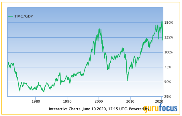
Today, the stock market is about 150% the size of the economy, close to the highest in history. In fact, it’s actually higher than that, as the second quarter’s GDP shrinkage isn’t taken into account here (a shrinking economy makes the figure higher, all else equal).
The Buffett indicator briefly dropped to 120% in March. To put that in perspective, the indicator hit a high of just over 140% during the peak of the 1990s tech mania. That means that during the pits of the COVID-19 bear market, the Buffett indicator was barely below the peak of one of the greatest bubbles in the history of the stock market.
During the 2008 meltdown, the Buffett indicator dropped to about 50%. That’s what a real, long-term market bottom looks like.
It’s always a mistake to read too deeply into a single indicator. While I’m naturally skeptical when I hear that “this time is different,” we do have to consider that some things really do change over time. The market today has a higher allocation to high-margin tech companies. Interest rates and inflation are lower. Stocks are more widely held by a larger swath of the population.
I get all that. Any of these could explain why the “normal” level may be a little higher than in years past. But does it explain the highest valuation in the history of the U.S. stock market?
That’s a tougher sell.
Meanwhile, other metrics tell a similar story. Back in April, I noted that the cyclically adjusted price/earnings ratio (CAPE) was on the expensive side. And again, that was in early April, when the current rally was still in its early innings. Today, the CAPE is back near pre-COVID highs.
None of this means the market has to drop tomorrow, of course. And an expensive market can stay that way indefinitely in the absence of a catalyst that breaks the status quo. We don’t know what that catalyst will be just yet. But my best guess is the Fed will eventually pull back its stimulus efforts, the market will react badly, and then the party is over for a while.
It might be smart to take a play from the Buffett playbook. By all means, stay mostly invested. But keep a little cash on the sidelines.
• Money & Markets contributor Charles Sizemore specializes in income and retirement topics, and is a frequent guest on CNBC, Bloomberg and Fox Business.
Follow Charles on Twitter @CharlesSizemore.