


Traders often use price charts to develop trading plans. These charts show the history of the market’s price action.
More importantly, the chart patterns offer insights into what traders are thinking.
The idea that charts show market psychology dates to at least the 1700s. By the early 1900s, there were several books explaining how charts were used by traders. Among the most read books is one called Technical Analysis of Stock Trends, first published in 1948 and still on analysts’ bookshelves.
As a group, traders tend to be optimistic or pessimistic. Optimistic traders buy and push prices up. Pessimists push prices down. Of course, there is more complexity to the market than that, and more subtlety in the chart patterns.
Today, the chart of the S&P 500 is showing a pattern called a broadening top with higher highs and lower lows. This signals a possible market top.
The S&P 500’s Broadening Top

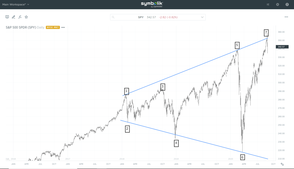
Source: Symbolik
Robert D. Edwards and John Magee, coauthors of Technical Analysis of Stock Trends, noted this pattern “suggests a market lacking intelligent sponsorship and out of control — a situation usually, in which the ‘public’ is excitedly committed and which is being whipped around by wild rumors.”
What a Broadening Top Chart Pattern Means
A broadening top consists of at least five points — at least three highs and two lows. More points are possible and indicate increased speculation.
This current chart pattern has seven points. It started forming in 2018, after the strong rally that started in November 2016 ended. As stocks peaked in early 2018, traders knew corporate earnings would rise because of tax reform.
Broadening tops often occur at important times.
Today, public participation is focused on a small group of tech stocks. Rumors drive large moves in these companies and rumors are shared online in a matter of seconds.
The reversal appears to be underway. It is likely to be as quick as the rally when it comes, and panic selling will replace panic buying.
Michael Carr is a Chartered Market Technician for Banyan Hill Publishing and the Editor of One Trade, Peak Velocity Trader and Precision Profits. He teaches technical analysis and quantitative technical analysis at New York Institute of Finance. Mr. Carr also is the former editor of the CMT Association newsletter Technically Speaking.
Follow him on Twitter @MichaelCarrGuru.