


Stocks are headed for a pullback. That is a certainty.
We know that a pullback is near because the S&P 500 Index always pulls back after it goes too far. The term “goes too far” may seem subjective, but it can be quantified.
The chart below shows the index with bands set 10% above the 200-day moving average (MA). Arrows highlight all the times the index closed at least 10% above the MA. When the index is more than 10% from average, it has gone too far in quantitative terms.
The S&P 500 Signals a Pullback

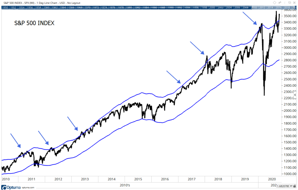
Source: Optuma.
The MA is used to define the trend. If the price is above the MA, the S&P 500 is in an uptrend. A downtrend is defined as times when the index is below its MA. For clarity, the MA isn’t shown in the chart above.
What the S&P 500 Moving Average Is Signaling
In the long run, prices tend to move above and below the MA. In mathematical terms, the MA is the central tendency of the trend. Large moves away from that value are unusual.
As the chart shows, price rarely moves more than 10% from the MA. This is shown by the small number of arrows in the chart. These relatively rare events are important because each one of them was followed by a pullback.
Some of the declines were small. In 2017, the pullback was less than 3%. Others were deeper. Earlier this year, the S&P 500 dropped more than 30% after this signal.
This chart doesn’t tell us how far prices will fall. But we should expect a decline to begin soon, most likely within days. As I noted in yesterday’s chart, the index is likely to make a new high before the pullback begins.
Combining these two ideas, investors have a roadmap into the end of the month. After a new high, it’s time to get defensive.
Michael Carr is a Chartered Market Technician for Banyan Hill Publishing and the Editor of One Trade, Peak Velocity Trader and Precision Profits. He teaches technical analysis and quantitative technical analysis at the New York Institute of Finance. Mr. Carr is also the former editor of the CMT Association newsletter, Technically Speaking.
Follow him on Twitter @MichaelCarrGuru.