



You have been to this game.
Fourth quarter. Your team is up six. The scoreboard looks fine.
But you stopped looking at the scoreboard a while ago. You are locked in on watching the floor.
One kid has scored 31 of the team’s 48 points. Two starters are sitting with four fouls. Nobody else has hit a shot since halftime.
Every parent in that gym can see what the scoreboard cannot. The lead is real. The team is gone.
The coach is not worried about six points. He is worried that one player is carrying the whole night, and that player is running on empty.
That is the S&P 500 Index right now.
The index sits about 1% off its August high. And underneath it, the average stock quit.
The Five Gauges I Check Before
Looking At a Single Stock
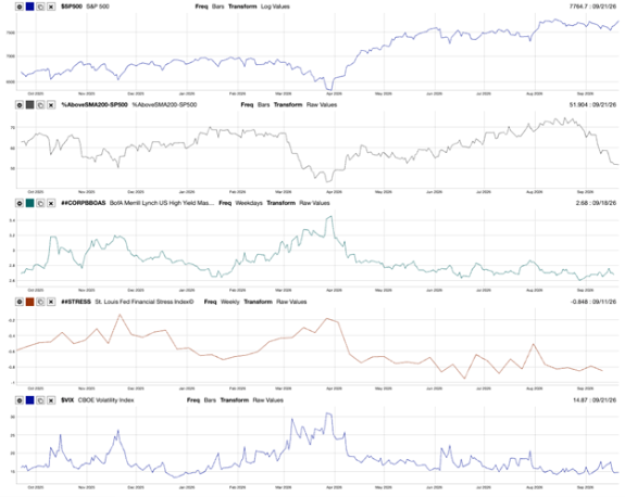
To show the risk of the broader market, I recently built the MC01 Risk Regime panel. Five lines, one page.

This panel does not tell me where the market is going.
Nothing does.
It tells me what kind of ground I am standing on when I make a decision.
Firm ground lets you buy a stock and give it room to grow. Soft ground means you size smaller and set tighter stops.
Here is what each line actually measures.
The top line is the scoreboard. That is the S&P 500, plotted on a log scale. Log matters more than it sounds. On a log chart, the same vertical distance always means the same percentage move. A 200-point drop from 7,600 is a 2.6% day.
That same 200 points from 3,000 would have been a 6.7% day. Same distance on a regular chart. Two completely different events. The log scale stops the recent years from screaming at you.
The second line is the team. It shows the share of S&P 500 companies trading above their own 200-day average price. Every company gets one vote. That means the biggest chipmaker in the index counts exactly the same as the utility nobody talks about.
The broad market does not work that way. The S&P 500 weights companies by size, so a handful of giants decide what the number does on any given day. That is the entire reason this line sits directly under the index.
One shows you the scoreboard. The other shows you the floor.
The third line is what lenders charge the shakiest borrowers. That is the high-yield spread: the extra yield investors demand to lend to companies with weak credit, over what they could earn risk-free in Treasurys.
Bond investors get paid to be pessimists. Stock investors get paid to dream. When something real is breaking in the economy, the lenders usually raise their prices before the stock market notices.
The fourth line bundles 18 items into a single number. The St. Louis Fed Financial Stress Index aggregates interest rates, spreads and volatility measures across the entire financial system into a single weekly reading. Zero means normal. Above zero means stress. Below zero means unusually calm.
The bottom line is the price of insurance. The Cboe Volatility Index (VIX) tells you what traders are paying right now to protect themselves over the next 30 days. High VIX means people are paying up for cover. Low VIX means they are not bothering.
Five gauges. One question: calm or rough?
Four Of Them Say Calm…
One Says The Team Walked Off
Look at the second panel again. That is the only line on the page doing anything.
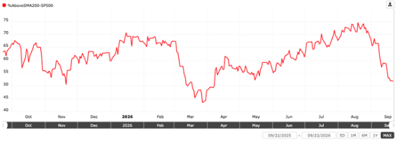

In early August, 74% of the S&P 500 traded above its 200-day average. Today, that number sits near 51%.
Run the math on what that means.
Roughly 115 companies in the index fell below their long-term trend line in about seven weeks. Nearly half the S&P 500 now trades below its own 200-day average. In early August, only a quarter of it did.
Three things make that drop worth your attention.
First, the speed. Most of the damage landed in the last three weeks. Breadth sat in the mid-60s at the start of September. It has given up 14 points since. That is not drift. That is an exit.
Second, the level. A reading of 51 is lower than anything this market produced all summer. In fact, you have to go back to April to find breadth this thin.
Third, and this is the one that matters, the index barely moved. Since early August, the S&P 500 has given back about 1%. Breadth gave back 23 points.
When those two numbers disagree that loudly, a small group of massive companies is holding the whole thing up.
Now look at the other three gauges, because they are the reason I am not telling you to run for the door.
High-yield spreads sit near the low end of their entire one-year range, well under the 3.45 they touched in April.
The lenders are not nervous.
The St. Louis Fed stress reading sits deep in negative territory, near its calmest levels of the past year. The VIX has crept up from the low teens, but it is nowhere near the 30 it printed in April.
So the credit market is calm. The plumbing is calm. Insurance is cheap.
That combination already has a name, and it is not “crash.”
What This Actually Means For Your Money
Here is my read, and I will not hedge it.
This is a narrowing market, not a breaking one.
When breadth collapses, and credit spreads blow out together, something in the economy is genuinely wrong.
That is not what this panel shows.
Spreads are tight. Stress is low.
What this panel shows is money leaving the average stock and crowding into a small group of winners.
That changes what you own. It does not change whether you own.
So do four things this week.
Run this chart on your own portfolio. Pull up every stock you hold and compare it with its 200-day average. Above the line means the trend is still working. Below means you are holding one of the 245.
Stop adding to anything already below its line. A narrowing market is the worst possible time to average down. It is the exact environment where a broken stock keeps getting cheaper while the index tells you everything is fine.
Set your tripwires now, not later. I am watching two numbers.
If the high-yield spread pushes through 3.00 and stays there, the lenders have changed their minds. If the VIX closes above 20 for a full week, so has everyone else.
Either one turns this market from narrowing into breaking, and that is when you act on the index itself.
Until then, you do not.
Put new money where the panel points. In a thin tape, the two factors that earn their keep are Quality and Volatility.
Quality screens for real returns on capital, real cash flow and manageable debt. Volatility screens out the names that swing hardest when fewer buyers show up.
Momentum and Growth get expensive at exactly this point in the cycle, because they concentrate you in the same handful of stocks already carrying the index.
One more thing, and it cuts the other way.
A breadth reading of 51 is not a buy signal either. Nobody rings a bell at 51.
In March, this same line went to 43 before it turned. Thin can get thinner.
The scoreboard says your team is up six. The floor says one kid is doing all the scoring.
Watch the floor.
Until next time…
Safe trading,

Matt Clark, CMSA®
Chief Research Analyst, What My System Says Today
