


There’s an old story traders tell about Jesse Livermore — the legendary speculator who made and lost several fortunes in the early 20th century.
Before the crash of 1929, Livermore didn’t have a Bloomberg terminal or an options chain to signal rising fear.
He had the tape. He had the way certain stocks moved when they shouldn’t have. And he had the sense, as he described it, that the market was “acting wrong.”
Not broken. Not collapsing. Just wrong.
We have better tools now.
Implied volatility surfaces, ratio spreads and intermarket signals – all of it would have made Livermore weep with envy.
But the underlying idea hasn’t changed .
Markets often reveal stress before it shows up in headlines.
And right now, behind what looks like a steady advance, something is misaligned.
On the surface, nothing stands out.
The S&P 500 Index continues to grind higher.
The VIX, which measures headline volatility, has come well off its March highs and is sitting in the mid-teens — a level that reads as complacent by recent standards.
For most observers, the message is simple: stability has returned.
But when you start pulling apart where the fear is concentrated — when you stop looking at the S&P 500 as a monolith and start looking at how the options market is pricing risk on the Nasdaq 100 relative to everything else — a very different picture emerges.
The key divergence is in implied volatility between large-cap tech exposure and the broader market. That gap is doing more than reflecting sector rotation.
It suggests risk is being priced unevenly, with concentration rather than dispersion driving sentiment.
Historically, these kinds of imbalances don’t persist quietly for long. They either normalize through time or resolve through movement.
For investors and traders alike, the question isn’t whether the market looks calm on the surface. It’s what kind of risk is building underneath it — and whether positioning is aligned with that reality.
And whether you’re a long-term investor or a short-term trader, understanding this development — and what it isn’t — is the difference between being prepared and being surprised.
When the Nasdaq Starts Worrying, Pay Attention
I came across a chart yesterday that deserves more attention than it’s getting.
It plots the ratio of Nasdaq-100 implied volatility (VXN) against S&P 500 implied volatility (VIX) going back to 2005.
What it shows is a market that, right now, is more nervous about tech than it has been at almost any point in the past two decades — including the dot-com hangover years and the 2017 to 2018 stretch when the Nasdaq was in its first strong AI-adjacent melt-up.
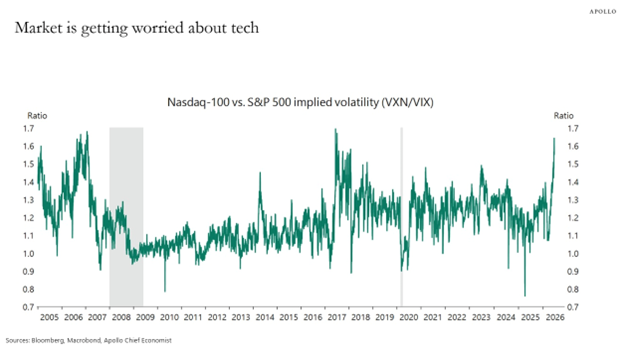

The ratio is currently flirting with 1.65 — levels not seen since the peak anxiety of the 2006 to 2007 pre-crisis period.
What that tells you is this: the options market is pricing in meaningfully more risk for the Nasdaq than for the broader S&P 500. The two have diverged in a historic fashion.
An elevated VXN/VIX ratio doesn’t mean the Nasdaq is about to crater. It means that traders are paying a premium to hedge tech exposure specifically — and that asymmetry matters before you put on any trade tied to growth or large-cap tech.
The market isn’t broadly panicking. It’s selectively scared. That’s a very different thing.
What the Gauges Are Telling Us
I tracked two readings for each index — an overall Green Zone Power Rating and a dedicated Volatility rating. Right now, they’re telling a story that’s worth reading carefully.
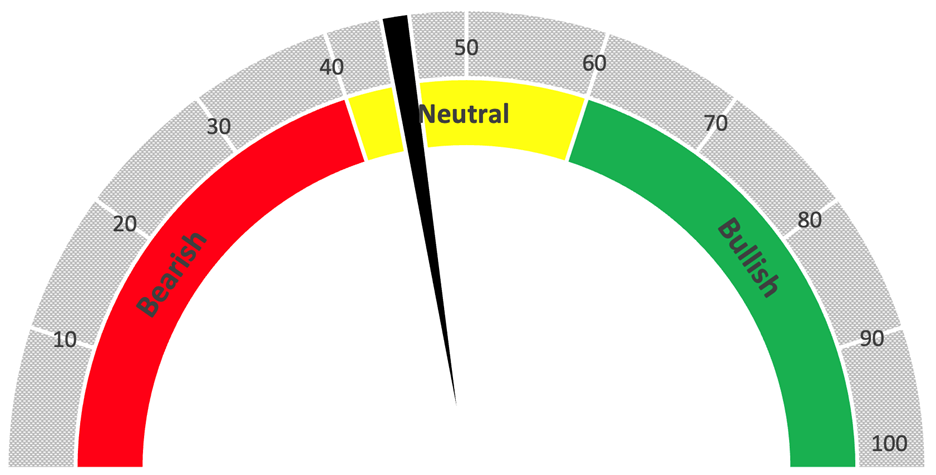
S&P 500 Index Overall Rating Neutral

S&P 500 Index Volatility Rating Midrange

The S&P 500’s overall Green Zone Power Rating is hovering just below the neutral threshold — not bearish enough to warrant stepping aside entirely, but not showing the kind of conviction you want to see before pressing into upside.
The Volatility Rating for SPX is similarly noncommittal, sitting in the low-to-mid neutral zone. A market digesting, not deciding.
Nasdaq 100 Overall Rating Close to Benchmark

Nasdaq 100 Index Showing Higher Volatility Than Benchmark

The Nasdaq 100’s overall Green Zone Power Rating lands in roughly the same neighborhood as SPX — both indexes are stuck in the same indecisive band.
But here’s where it gets interesting: the Volatility rating for the Nasdaq 100 is meaningfully higher than the SPX reading (lower Volatility rating means stronger Volatility overall).
The broad market is unsettled. Tech is more unsettled.
That gap is exactly what the VXN/VIX chart has been screaming about, and our own gauges are independently confirming it.
This isn’t a coincidence. It’s a signal. When two separate lenses — one built on options market pricing, one on our proprietary ratings — are pointing at the same divergence, you pay attention.
What It Means Going Forward
Here’s the read: we have a market that’s broadly neutral on direction but increasingly anxious about tech-specific risk.
The VXN/VIX divergence suggests options on Nasdaq-heavy names are pricier relative to the market right now.
Meanwhile, the overall and Volatility ratings for both indexes are threading the needle between bearish and neutral, with no clear resolution.
What the gauges and the chart I came across have in common is this: they’re all pointing at a market that hasn’t made up its mind yet.
That’s not a reason to panic.
But it does mean we need to stay sharp — because when markets that are “acting wrong” finally act, they tend to do it quickly.
Livermore would have recognized it immediately.
Until next time…
Safe trading,


Matt Clark, CMSA®
Chief Research Analyst, Money & Markets