In the midst of the longest bull market run in history, markets hit an all-time high in September.
But more and more evidence continues to pile up that September’s highs were the last hurrah for the bull as the relative returns during the third quarter of 2018 closely follow a pattern set before for other bull market tops during the past 50 years, according to an opinion column on by MarketWatch’s Mark Hulbert.
At its late-November low, the S&P 500 SPX, -0.74% was more than 10% below its all-time high of 2,930.75, where it closed on Sep. 30. If we rely on the semi-official definition of a bear market as a drop of at least 20%, the stock market at that point was already halfway there.
It’s not a new idea, of course, that market sectors perform in relatively predictable ways in the latter stages of a bull market. For this column, I relied on data from Ned Davis Research, the quantitative research firm. They calculated the average return of the S&P 500’s 10 sectors over the last three months of each prior bull market top (back to the early 1970s). This enables them to periodically look at how that historical ranking compares with how the sectors are actually performing.
An example can make this process clearer. According to Ned Davis Research, the health care sector was the second-best performer (on average) over the three months prior to past bull market tops. Ominously, it was also one of the best performers over the three months prior to the Sep. 30 market top — in first place, as a matter of fact.
At the bottom of the rankings, Utilities typically is the worst-performing sector during the last three months of past bull markets. Its ranking this time around: 8th out of 10.
To be sure, as you can see from the chart below, the correlation is not perfect. But it’s much closer than random. Notice that the sectors at the top of the ranking for past late-bull-market performance were also at the top in this year’s third quarter, just as those at the bottom before remained at the bottom. (Not included in the chart are the S&P 500’s recently created “Communications Services” sector and the recently terminated “Telecom Services” sector.)
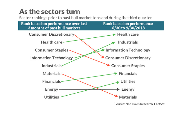
One way of measuring the extent of correlation is a statistic known as the correlation coefficient, which would be 1.0 if there was a perfect one-to-one correspondence between the sectors’ historical ranking and their more recent one — and zero if there were no detectable correlation. The coefficient in the case of the rankings in the accompanying chart is 0.68. This translates into an r-squared of 0.47, which means that the historical ranking “predicts” or “explains” 47% of the third-quarter’s ranking.)
Why would the sector rankings shed any light on where we are on the market cycle? One reason is that the stock market may be anticipating an imminent economic slowdown, in the process favoring more defensive sectors such as Health Care and Consumer Staples. Another reason is that interest rates typically start rising in the latter stages of a bull market, and higher rates have a disproportionately negative impact on “Financials” and “Utilities.”
Needless to say, the sector rankings provide just one data point, and you should never rely on any one indicator — no matter how good its track record.
Ned Davis, for his part, looks at a myriad different indicators, and those indicators never speak with one voice. Though Davis is not outright bearish right now, it is noteworthy that he recently shifted his outlook from bullish to neutral with a “defensive” bias.