
Editor’s Note: Have you missed any of Mike Carr’s charts in Money & Markets Daily? We’ve got you covered. Monday to Friday, Mike highlights a chart that catches his eye — and what it could mean for markets or the economy going forward. Check out his analysis from the last week below.
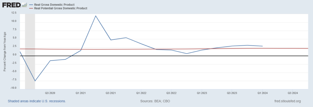
GDP Shows Inflation Is Alive and Well
Analysts cheered last week’s news on gross domestic product (GDP). The Bureau of Economic Analysis revised GDP to show economic growth of 1.3% during the period. This data was down from 1.6% growth in the first reading in April and is in line with economist estimates.
A slowdown in consumer spending drove the revision. The initial reaction was that this was good news because lower consumer spending should decrease inflationary pressures and give the Federal Reserve room to cut rates this year.
Digging deeper, however, we see that the economy is still growing too fast for the Fed’s taste. The Fed’s chart below shows real GDP growth (the blue line) adjusted for inflation. The red line is the Fed’s estimate of how fast the economy should grow. Growth is still above the Fed’s estimate, which means Fed officials are still worried about inflation. Rate cuts could be off until 2025.
Real GDP vs. Fed’s Estimate of the Economy’s Growth
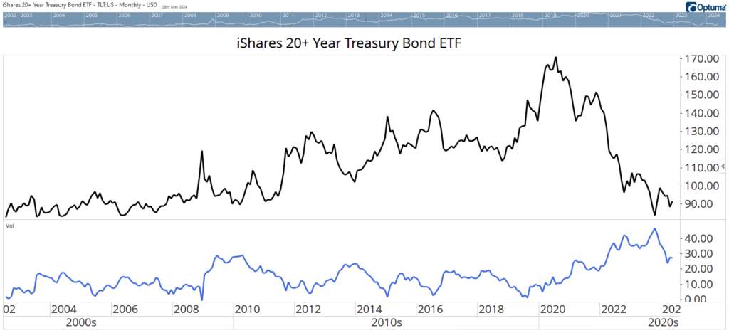
An Important Shift in the Bond Market
Many investors view bonds as safe and boring. That’s because they have been so for decades. Since interest rates peaked in 1982, bonds have delivered steady gains in the long run. However, the long-term trend in interest rates has changed. After the 10-year Treasury yield fell below 1% in 2020, the only place for yields to go was up.
Interest rates have generally trended in the same direction for 30- to 40-year periods. That means rates should continue drifting higher until 2050 or so. The move won’t be straight up, but the trend is up, and so is volatility.
The chart below shows the price of the iShares 20+ Year Treasury Bond ETF (Nasdaq: TLT). The indicator at the bottom is volatility, which is similar to the VIX for bonds. The indicator shows that volatility rose and is now well above the trading range that existed from 2002 until 2020. We’re now in a new environment, and bonds are no longer safe and boring.
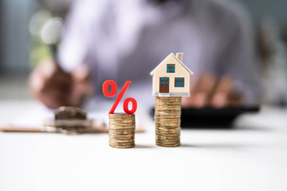
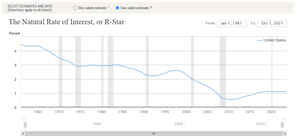
Mortgage Rates Might Stay Above 5% Forever
Hopes for a Federal Reserve interest rate cut are high. We all want to return to the low rates we enjoyed in the 2010s, but that may not happen. Inflation was low and stable then, which was a holiday from economic history in some ways.
Inflation is more often unstable. In regular times, investors demand a higher return on investment than they did in recent years.
The Federal Reserve chart below shows the estimated rate investors demand as a return on investment. It’s rising and could move back above 3%. In the 1960s, a time of similar uncertainty about inflation coupled with rising government deficits, the rate averaged 3.5%. Add in inflation of 2%, and Treasurys would stabilize near 5.5% — about 1% above the current level.
Mortgages are riskier and generally trade about 1% above Treasurys. That makes a standard mortgage of 6.5%. Hopefully, investors will demand a lower return on investment, and mortgages can drop toward 5%, but that’s a best-case scenario. Mortgage rates will remain higher than we enjoyed a few years ago, and that’s likely to be the case forever.
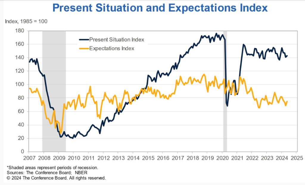
Consumer Confidence Could Sink the Economy
For most of the past 15 years, consumers were optimistic. Confidence rose steadily from the end of the 2009 recession until the 2020 pandemic shocked everyone.
This is the black line in The Conference Board’s chart below. Over that time, on average, consumers expected the next six months to be similar to what they were currently experiencing. That’s the orange line.
Since the government stimulus checks stopped, consumers have been saying that their present situation is okay, but just okay. There’s been a steady downtrend in their expectations. This explains the ‘vibecession’ economists believe is occurring. They say the data is good, but consumers don’t believe it.
Consumers are worried, and it will take a dramatic change to alleviate their concerns. A Fed rate cut, and lower mortgage rates, could reverse these trends later this year. That could push stocks toward a bubble, but that’s a problem for another day.
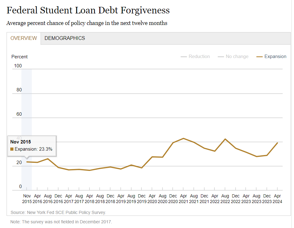
Consumers Expect More Free Money
Consumers’ expectations regarding increases in federal assistance and social insurance programs improved — according to the Federal Reserve Bank of New York’s Public Policy Survey.
The average perceived likelihood of an increase in federal welfare and unemployment benefits rose to 36% and 30.4%, respectively, while 39.0% expected more student loan write-offs (see Federal Reserve chart below).
Paying for these benefits isn’t a concern of many. Expectations of higher income taxes for the highest wage earners rose from 34.2% to 41.0%.
These results might not mean much in an election year when voters want tangible benefits and politicians want to buy votes. But government spending is unsustainable, and a long-term reckoning is overdue. When it comes, it will be painful for voters, the economy, and investors.
That’s it for this week’s edition of Chart of the Day.
Until next time,

Mike Carr
Chief Market Technician