


Editor’s Note: Have you missed any of Mike Carr’s charts in Money & Markets Daily? We’ve got you covered. Monday to Friday, Mike highlights a chart that catches his eye — and what it could mean for markets or the economy going forward. Check out his analysis from the last week below.
The Fed’s Biggest Problem
Interest rates might now be beyond the Federal Reserve’s ability to control. The U.S. central bank controls monetary policy, sets key rates, and ensures there is enough money in circulation for the economy to function. Congress and the president share responsibility for fiscal policy and the amount of money the government spends.
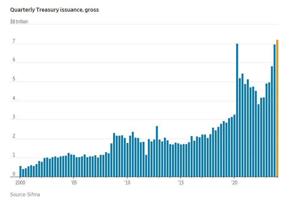
After decades of deficit spending, fiscal policy is closer to the inevitable crash everyone knows lies ahead. To fund deficits, the Treasury Department issues debt. And its doing so at a record-breaking pace right now.
According to The Wall Street Journal:
In the first three months of 2024, the U.S. sold $7.2 trillion of debt, the largest quarterly total on record. That surpasses the second quarter of 2020, when the government was financing a wave of Covid-19 stimulus. It also builds on a record $23 trillion of Treasurys issued last year, which raised $2.4 trillion of cash, after accounting for maturing bonds.
The chart below shows this. With unemployment at 3.8%, the economy is good. Debt should be decreasing, not growing at record highs. This is putting upward pressure on interest rates and might make it impossible for the Fed to use monetary policy to offset risks when the economy slows.
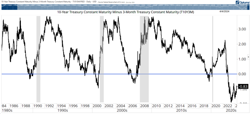
The Yield Curve Is Still Inverted
The yield curve has been a 100% accurate recession warning since it was discovered in the 1980s. It’s the difference between yields on 10-year Treasury notes and 3-month Treasury bills.
Usually, the yield on 10-years is higher than the yield of the 3-month. That makes sense since more risks could affect the economy over 10 years. When the 3-month yield is higher, that creates an inverted yield curve.
You can see the curve in the chart below, with values below zero (the blue line) indicating that the curve is inverted. The current inversion began 18 months ago. Many investors are ignoring the indicator, thinking it’s wrong this time. But the chart shows that recessions (vertical grey bars) begin after the curve returns to normal — or when the inversion ends. That hasn’t happened yet, which means a recession is still on the horizon.
Yield Curve Remains Below Zero
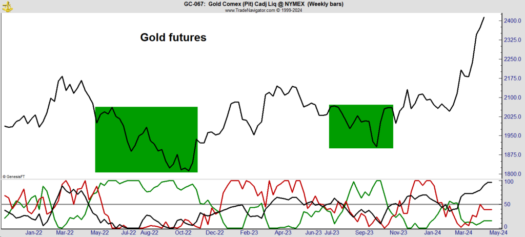
Wait for a Pullback in Gold
Gold prices have raced ahead in the past few weeks and seem to be ahead of themselves. The chart below is based on action in the futures markets and shows who is buying gold.
In this market, hedgers — the miners or users of gold like jewelry companies — must report their positions to regulators. That’s the green line at the bottom. Hedge funds also report, and they’re the red line at the bottom. All other trades are individuals, the black line at the bottom. The latest rally has been driven by individuals as hedgers sold.
The best time to buy gold is when the hedgers are buying, shown by the green boxes in the chart. This indicator tells us there should be a better buying opportunity within the next few weeks.
Tracking the Best Time to Buy Gold
The Great Housing Mystery Explained
Higher mortgage rates should reduce home prices. That’s because most people shop by payment. In other words, they determine the amount of their mortgage payment, find out how much home that buys, and then start shopping. Higher rates mean higher payments, which should lead to lower home prices as sellers are forced to meet buyers where they are.
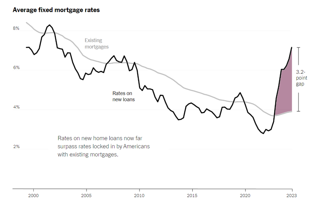
Over the past year, mortgage rates rose, but so did home prices. Research from the Federal Housing Finance Agency (FHFA) explains what happened.
Researchers found that over the past two years, higher rates should have resulted in a 3.3% drop in prices. But homeowners refused to sell because their existing mortgages were lower than what they’d have to pay for a new home. You can see the gap between existing mortgage rates and rates on new loans in the New York Times chart below. Many couldn’t afford a similarly priced home, so they chose to stay put.
The FHFA believes “this mortgage rate lock-in led to a 57% reduction in home sales with fixed-rate mortgages in 2023Q4 and prevented 1.33 million sales between 2022Q2 and 2023Q4.” This trend is getting worse, with current rates now about 3.2% above existing mortgages. This points toward higher home prices and possible buys in the homebuilding sector.
Gap Between Rates on New Loans & Existing Mortgages
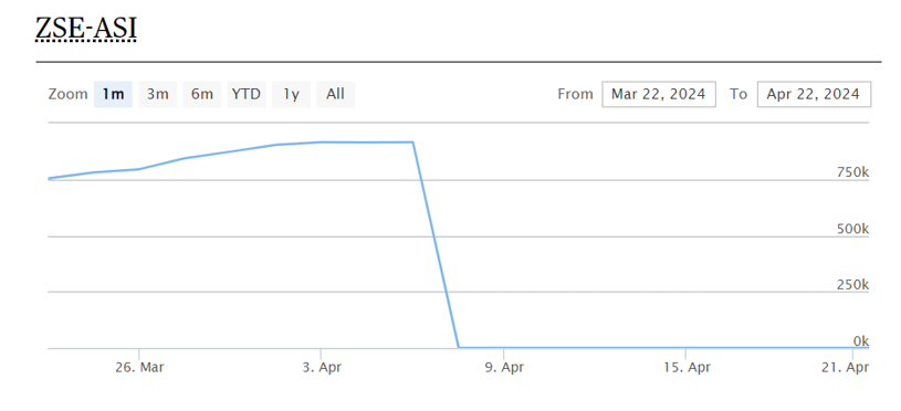
Investors Need to Learn From Zimbabwe
Zimbabwe has struggled with hyperinflation for years. This has made the country’s currency almost worthless as it boosted the notional value of stocks. To tackle the inflation problem, Zimbabwe frequently reset the value of its currency. These devaluations helped for a time, but then the Zimbabwean dollar always collapsed.
To break this cycle, the country issued a new gold-backed currency. The ZiG, short for Zimbabwe Gold, gained more than 2% against the U.S. dollar since its debut on April 5. At the same time, Zimbabwe’s new currency has wiped out a gain of more than 330% on the stock market this year. You can see that wipeout in the African ‘Xchanges chart below.
This is a dramatic example of the impact currency has on stock prices. Japan offers another example with its weak yen. The benchmark Nikkei 225 Index is up 12% since the start of the year. iShares MSCI Japan ETF (NYSE: EWJ) is up just 4.7% over that time due to the impact of a strong dollar.
Investors wanting exposure to top Japanese stocks without currency risks could consider WisdomTree Japan Hedged Equity Fund (NYSE: DXJ), which is up 21.2%. When looking overseas, always consider the impact of currency.
Zimbabwe Stock Exchange (ZSE) Plummets After New Currency
That’s it for this week’s edition of Chart of the Day.
Until next time,
Mike Carr
Chief Market Technician