


Editor’s Note: Have you missed any of Mike Carr’s charts in Money & Markets Daily? We’ve got you covered. Monday to Friday, Mike highlights a chart that catches his eye — and what it could mean for markets or the economy going forward. Check out his analysis from the last week below.
The Job Market Is Changing Rapidly
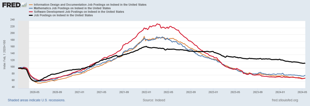
Computer science majors have long enjoyed strong job markets. However, demand for software developers and other IT jobs has fallen 70% in the past two years.
The chart below shows that Indeed.com job postings for software developers (the red line) have been down sharply since 2022 when the profession had the highest number of listings on the job board.
Postings for jobs related to math (blue) and information systems support (orange) are down more than 60%. These positions, associated with the tech sector, are down much more than total listings, which dropped just 33% since the 2022 peak.
The good news is that job listings are still 15% above their pre-pandemic level. The bad news is that high-paying jobs are getting harder to find.
Indeed.com Job Postings
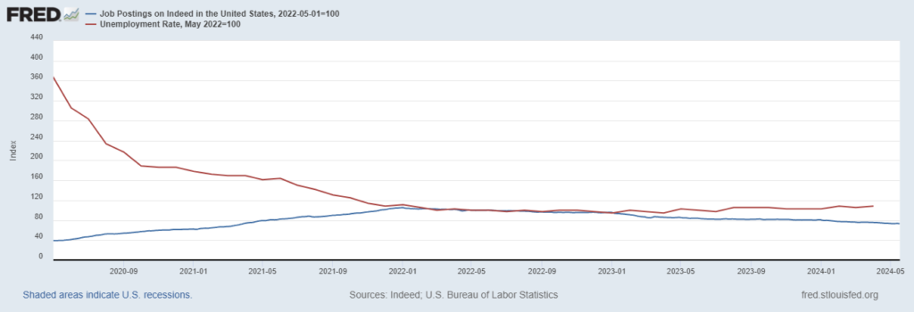
Real-Time Data Shows Unemployment Is Set to Rise
Unemployment is low by historical standards. April’s 3.9% reading is already 0.5% above last year’s low. Economists have long believed a recession is inevitable when the unemployment rate rises that much. Now, real-time data adds to the bearishness of the jobs market.
Indeed.com provides a weekly update on job listings. This indicator peaked in January 2022 and is now more than 30% below its high. As job postings (the blue line in the chart below) fell, the unemployment rate (the red line) moved higher.
This is an obvious link. The trend in job postings remains down, which points to higher unemployment in the coming months. The data continues to tell us that the Federal Reserve will be forced to cut rates this year.
Job Postings Fell as Unemployment Rate Rose Higher

Elite’s “Vibecession” Shows Disconnect With Working Class
Nobel Prize-winning economist and New York Times columnist Paul Krugman insists that the economy is doing fine. The problem is that the average person doesn’t believe that. He frequently writes about this state of affairs, calling it a ‘vibecession’ — a strong economy that feels like a recession.
The Federal Reserve chart below shows there might be more weakness than New York Times economists see. Retail sales (the blue line) are well above their pandemic lows, but real wages (the green line) fell about 8% since then. Both values are adjusted for inflation.
Average wage earners are falling behind. However, retail sales remain strong as senior citizens, many of whom are well off, are spending more than ever. If Krugman gets out of Manhattan, he might learn it doesn’t feel like a recession. Wage earners, the average person, really are falling behind.
Retail Sales Vs. Real Wages
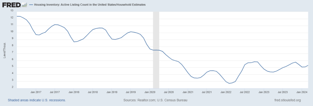
Homes Are in a Long-Term Bull Market
Supply and demand determine home prices. One way to look at supply is the ratio of listings to households in the country, as shown in the Federal Reserve chart below.
While this measure of supply has been in a long-term downtrend, the current level is less than half of what it was when the Federal Reserve began publishing the data in 2016. In the long run, home prices will likely continue moving higher until supply increases. However, it seems unlikely that supply will increase soon.
Housing Inventory: Ratio of Listings to Households in U.S.
That’s it for this week’s edition of Chart of the Day.
Until next time,

Mike Carr
Chief Market Technician