


Editor’s Note: Have you missed any of Mike Carr’s charts in Money & Markets Daily? We’ve got you covered. Monday to Friday, Mike highlights a chart that catches his eye — and what it could mean for markets or the economy going forward. Check out his analysis from the last week below.
New All-Time Highs Point to Strong Bull Markets
The S&P 500 Index reached a new all-time high in January this year — and has continued reaching new highs ever since. Some investors get nervous at new highs, wondering if the rally can continue. History says yes…
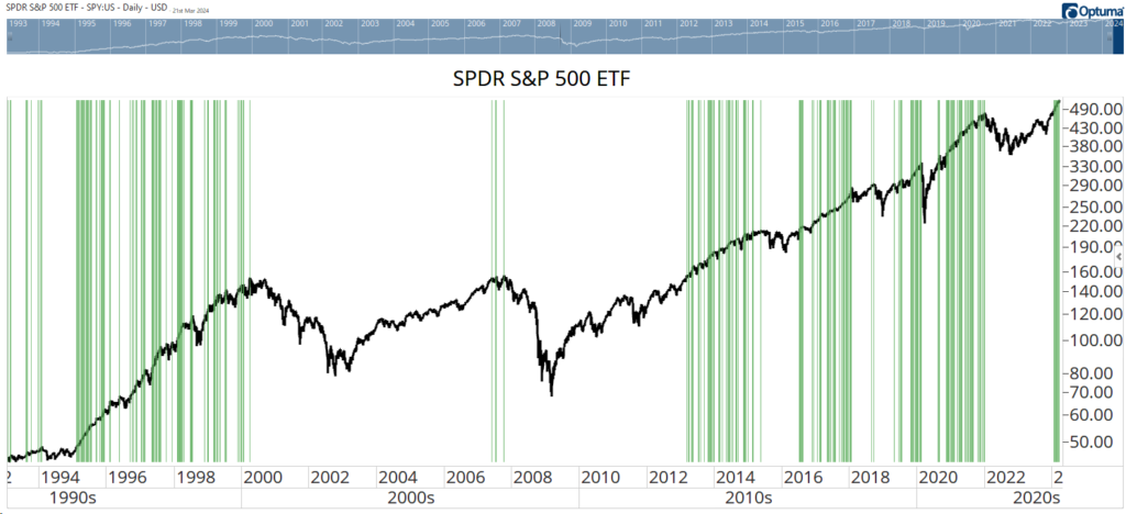
The chart below shows the trajectory of the SPDR S&P 500 ETF (NYSE: SPY) since the 1990s. The green bars highlight new highs. Since SPY began trading in 1993, new highs have clustered for months at a time.
The exception was in 2007 as the market topped before a devastating bear market. That decline was caused by a black swan event — a credit crisis no one anticipated. But absent a black swan, history tells us this bull market could continue for months, or even years.
New Highs for SPY
This Indicator Shows We Aren’t in a Bubble
Analysts are increasingly worried that tech stocks are ahead of themselves. They point to the rise of the “Magnificent Seven” as proof that the market is focused on just a few stocks.
Now, it could be a reason to worry — if they were right. But they aren’t.
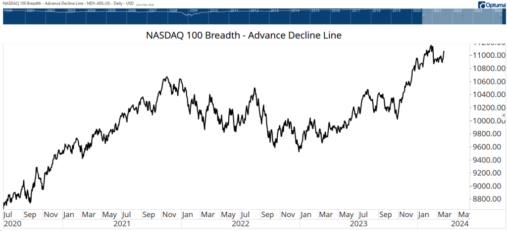
Investors are spreading their bets in tech. They aren’t just focused on those seven stocks that were successful in 2023. The chart below is the advance-decline line for the stocks in the Nasdaq 100. Every day, the number of stocks that went down is subtracted from the number that went up. That’s added to the previous day’s total to create this line.
When it’s rising and at a high level, as it is now, it shows that more stocks are going up than down on most days. This is not a sign of a narrow market. It’s a healthy bull market that could carry prices significantly higher.
Advance-Decline Line in Nasdaq 100 Is Rising
Durable Goods Hint at Economic Growth
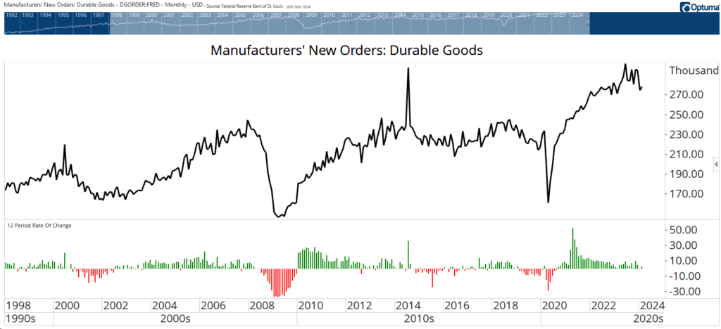
New orders placed with U.S. factories for durable goods rose in February for the first time in three months, suggesting that firms are somewhat optimistic about the direction of the economy. February’s rise also pushed the year-over-year change in orders back into positive territory.
New orders might not be headline-grabbing, but it’s one of the best pieces of economic data for investors to follow. Holding stocks only when the 12-month rate of change is positive has more than doubled the returns of a buy-and-hold strategy since 1993 when the government began publishing the data.
That strategy sidesteps almost every 10% drop in the stock market over that time. Tuesday’s news points to better-than-average market gains with lower-than-average risk.
Cocoa’s Incredible Rally Threatens This Stock Market Winner
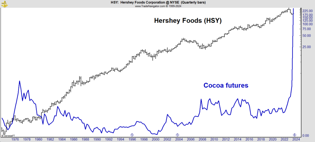
Over the past 20 years, Hershey Co. (NYSE: HSY) has quietly delivered Warren Buffett-like returns. The stock recorded an average annual return (including dividends) of 10.5%, which was slightly better than the 10.1% posted by Berkshire Hathaway (NYSE: BKR.A).
While Buffett’s gains were driven by his stock-picking skills, Hershey’s may have been driven by low cocoa prices.
The chart below shows HSY (the black line) and cocoa futures (the blue line). HSY’s steady gains are now threatened by a surge in cocoa, which according to Bloomberg, “surged above an unprecedented $10,000 a metric ton on Tuesday before erasing gains and taking a breather from a historic rally that has seen prices of the key chocolate ingredient double this year.”
While cocoa futures may lose some of those recent gains, Hershey’s and other chocolate makers are likely to face pricing pressures. Long-term put options on those stocks are an ideal way to trade this news.
Cocoa Futures Surge
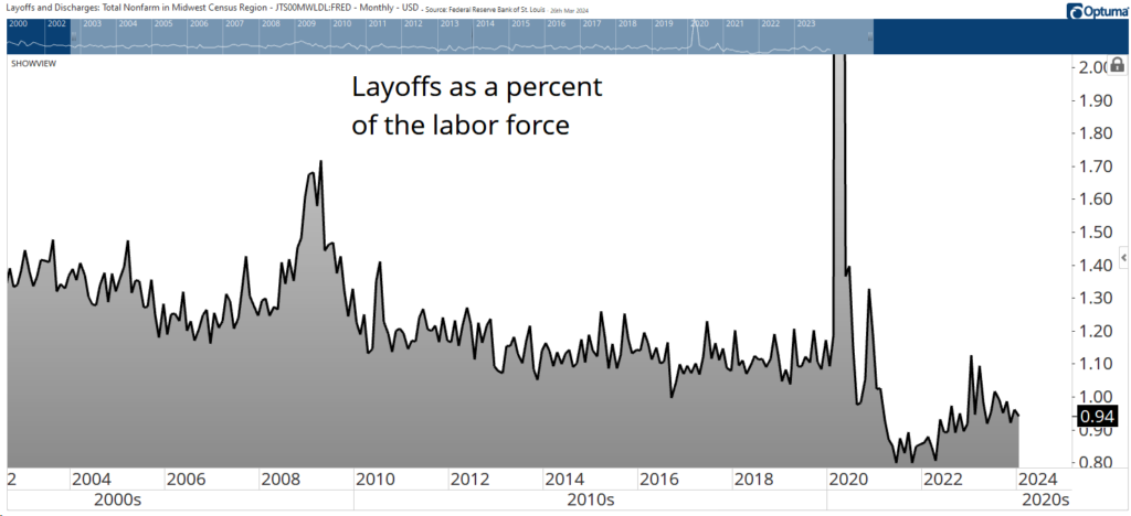
Layoff Are Actually Below Average
Headlines announce new layoffs almost every day. Citigroup, Stellantis and Canada Goose announced significant job cuts this week.
We have seen tech layoffs dominate the news for months. Nearly 20,000 employees in that once high-flying sector have lost their jobs this year after more than 262,000 layoffs last year.
As always, the headlines don’t tell the full story. The chart below shows layoffs as a percentage of the total workforce. At 0.94% for February, the latest available data metric is below the pre-pandemic average of 1.14% per month.
Layoffs are well below average, a sign that the economy remains strong despite concerns about its health.
That’s it for this week’s edition of Chart of the Day.
Until next time,

Mike Carr
Chief Market Technician