Editor’s Note: Have you missed any of Mike Carr’s charts in Money & Markets Daily? We’ve got you covered. Monday to Friday, Mike highlights a chart that catches his eye — and what it could mean for markets or the economy going forward. Check out his analysis from the last week below.
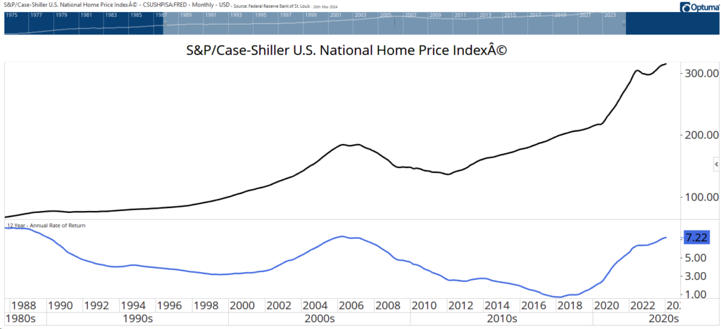
Is Your House Really a Good Investment?
Home prices soared since 2020. We were reminded of this last week when the latest S&P CoreLogic Case-Shiller data was released. Home prices increased at the fastest rate since 2022 in January, up 6% in the past year. Prices are up about 46% since January 2020. This is a national home index, so your city may be up substantially.
Now, this data doesn’t tell us how homes appreciate over the long run. The chart below shows the average annual return over a 12-year holding period. That’s about the amount of time the average homeowner stays in their house.
The SPDR S&P 500 ETF (SPY) delivered an average return of 13.6% over that same time. Of course, most homeowners use leverage with mortgages, so their cash-on-cash gains are much higher.
Considering that, houses likely beat stocks for many individuals. But it’s also important to notice that the current average return is at the same level where it peaked in the past. It’s possible the housing market is nearing a pullback.
Case-Shiller Home Price Index vs. Annual Rate of Return Over 12 Years
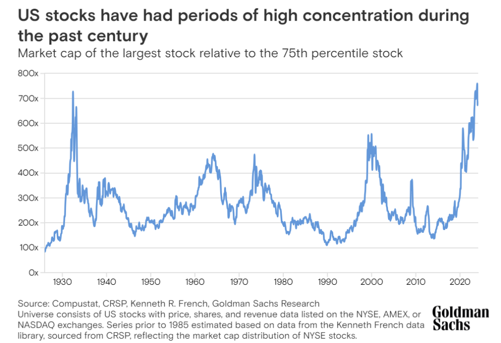
Concentration Hasn’t Been This High Since 1932
Stocks reached their Great Depression low in 1932, which was the time to buy. Yet the stock market was highly concentrated at that time. Concentration — the fact that a few large stocks are responsible for most of the gains in major market averages — is a cause of concern for many investors right now.
Peaks in concentration in 2000 and 2009 coincided with bull market tops. But the Goldman Sachs chart below shows that the previous record in concentration was set in 1932, the year the market bottomed.
Now, this doesn’t mean we will see the market rally for the next five years as it did after that peak. It just means we shouldn’t get unduly excited about concentration in the market since it has a decidedly mixed record of calling market tops.
Advance-Decline Line in Nasdaq 100 Is Rising
Source: Goldman Sachs.
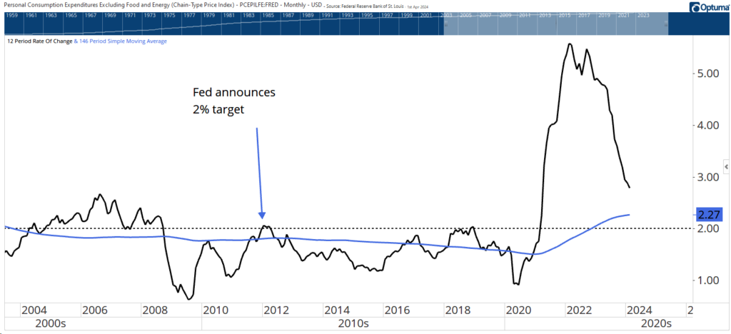
The Fed Can Declare Victory
Inflation data is providing us mixed news. The core consumer price index (CPI), which excludes food and energy prices) is at 3.8%, well above the Federal Reserve’s 2% target. The Fed’s preferred measure — core personal consumption expenditures (PCE) — is much closer to the target at 2.8%.
The Fed has been targeting 2% since 2012. Over that time, core PCE has been less than 2% for most of the time. This is shown in the chart below. The black line is the year-over-year change in core PCE. The dashed horizontal line shows 2%. The blue line is the average of core PCE since then-Chair Ben Bernanke announced the 2% target.
In 2020, Fed Chair Jerome Powell said the central bank would switch to “average inflation targeting.” That means it will allow inflation to run “moderately” above the Fed’s 2% goal “for some time” following periods when it has run below that objective.
Bottom line: With the long-term average of core PCE at 2.27%, the Fed can (and might) declare victory at any time.
Core PCE Is Near Fed’s Target of 2%
The Economy Is Back on Track
The ISM Manufacturing Index broke above 50 for the first time in 16 months as manufacturers grew more optimistic.
This economic indicator — shown by the orange line in the chart below — is based on a survey of purchasing managers from various industries who report on factors such as new orders, production, employment, supplier deliveries, and inventories. (A reading above 50 indicates expansion in the manufacturing sector, while below 50 indicates contraction.)
Manufacturing represents about an eighth of the economy. However, it’s more important to growth than that. Indirect effects of that spending account for a quarter of GDP.
The turn into positive territory for the first time since 2022 could signal better-than-expected GDP growth for the rest of the year. We need to see confirmation in next month’s report, but the subindexes in the report show that’s likely.
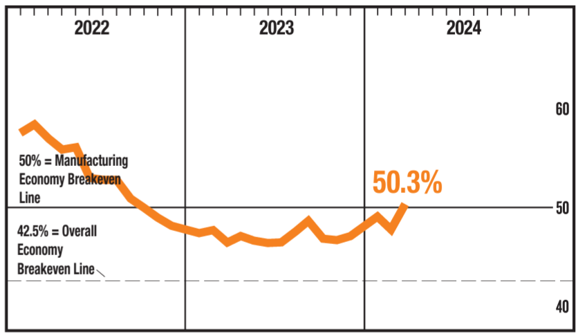
Source: ISM.
Inflation in Services Sector Is Easing
The ISM Report on Services shows that the sector is still expanding. Like the ISM manufacturing report, readings above 50 are associated with a growing economy. The report on services also has several subindexes. And one of those provided good news for those worried about inflation.
The chart below shows that the Prices Paid Index dropped in March 2024 to its lowest level since March 2020. This is important because spending on services accounts for 61% of the Consumer Price Index.
At 53.4, the index shows that prices are still rising even though they are rising at a slower pace. This means inflation could fall later this year if the cost of services continues dropping.
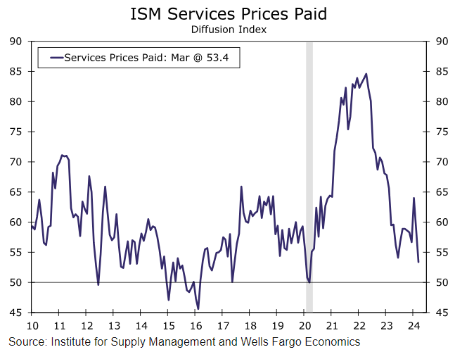
Source: Well Fargo.
That’s it for this week’s edition of Chart of the Day.
Until next time,

Mike Carr
Chief Market Technician