Editor’s note: Below you’ll find Mike Carr’s top charts featured over the last week in Stock Power Daily. As an added bonus, we’ve topped this story with an exclusive from Mike. Read on…
Economists See a Wonderful Economy — but That’s Not Real Life
Economists often joke that they suffer from “physics envy.” They see the complex formulas in physics textbooks and try to duplicate them in their own work.
The problem is that, in physics, the formulas deliver one correct answer. In economics, the formulas are largely guesses about how things should work.
Not all formulas are complex.
Economists use a fairly straightforward definition of a recession, and it’s not the oft-quoted two quarters of negative GDP growth in GDP. It’s persistent, pervasive and pronounced weakness in economic activity.
To determine when the economy is suffering from persistent, pervasive and pronounced weakness, economists look at six indicators.
One of them was updated last week. In January, real personal income less transfer payments reached a new all-time high. Check it out in this chart.
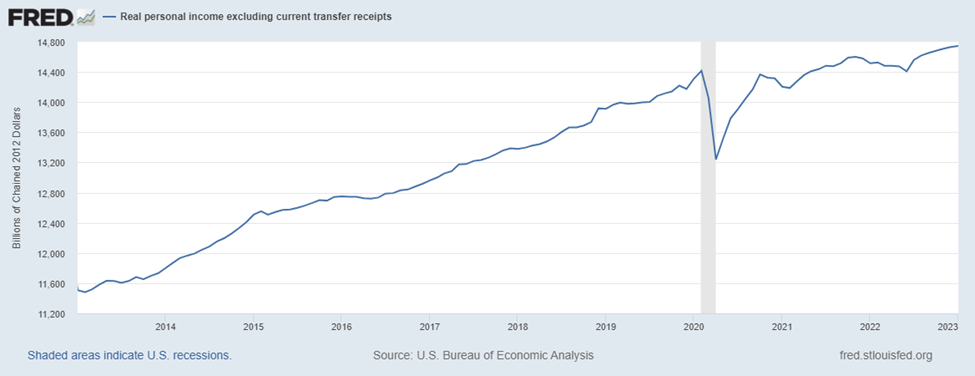
Source: Federal Reserve.
This indicator is adjusted for inflation. It excludes government benefits like Social Security and unemployment insurance.
And three of the other factors are also at all-time highs:
- Income.
- Two employment indicators.
- And consumer spending.
With four of the big six indicators at new highs, economists have no evidence of recession.
But in the real world, we don’t need to rely on complex indicators to see the economy is struggling.
We know spending is up, but we also know we are falling behind as we spend more on food and gas and less on the things we want to do.
Bottom line: In the time, the fancy formulas will catch up with what we know. The economy is in trouble, and we need to get ready for an even more troubled economy.
Initial Claims Show Companies Are Hoarding Labor
Initial claims for unemployment insurance are an important economic indicator.
The unemployment rate shows whether companies are adding or shedding employees.
Claims for unemployment show whether laid-off employees are finding jobs or not.
Right now, new claims for unemployment are about 0.1% of the civilian labor force.
This ratio allows us to compare claims over time.
During the early 2000s, the ratio averaged around 0.2% and then jumped to 0.4% during the financial crisis in 2009.
Bottom line: The low ratio shows that employers are hiring. This is good news for workers.
But it’s bad news for investors because strength in the labor market will force the Federal Reserve to raise rates.
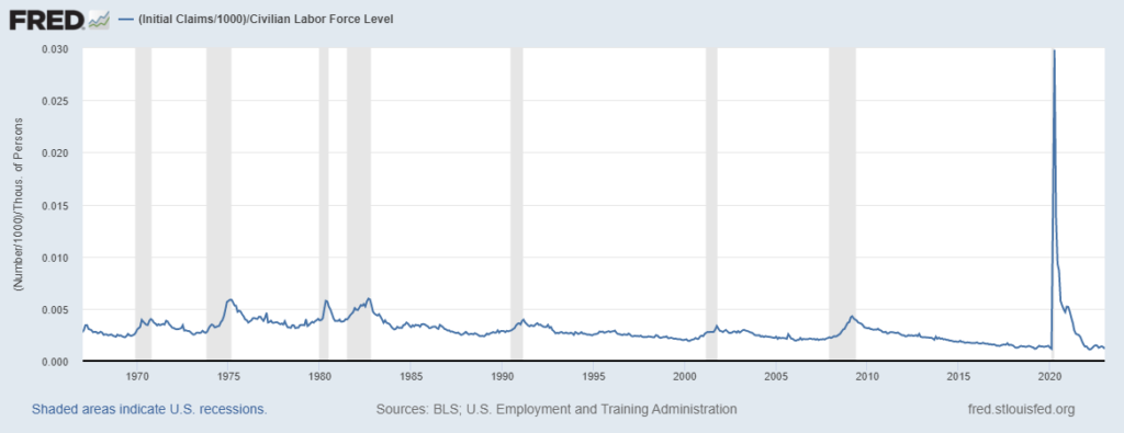
Source: Federal Reserve.
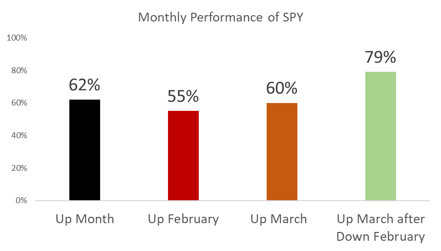
After a Down February…
The SPDR S&P 500 ETF (NYSE: SPY) fell about 2.5% last month.
A monthly loss in the fund is kind of unusual. A little more than one in three months is a loser. But it may be a good thing…
Over the past 30 years, SPY delivered gains over a one-month period 62% of the time. For some reason, February is one of the weakest months, delivering gains just 55% of the time. March is also slightly less bullish than average with gains 60% of the time.
But history says this March could be a winner.
After a losing February, March has ended higher 79% of the time. Unfortunately, March has also been a down month 75% of the time during bear markets.
Bottom line: The data in the chart below isn’t tradable, but it does tell us to expect higher-than-average volatility this month. That environment can be difficult for long-term investors to suffer through, but short-term traders should be excited about the prospects.
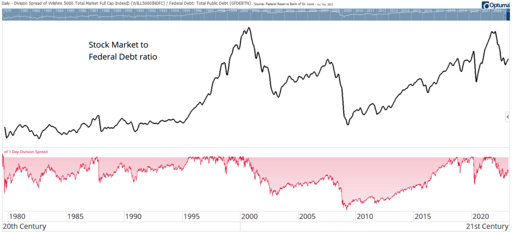
The Bear’s Not Over
The Buffett Indicator compares the size of the stock market to gross domestic product (GDP), aka the size of the economy. It’s called that because the Oracle of Omaha follows it, and high values warn of stock market weakness.
An alternative view is to consider the size of the stock market relative to the federal debt like you see in the chart above.
Investors have limited resources. They must choose between stocks and bonds.
When the ratio is high, the allocation to stocks is too high.
At the bottom in red is an indicator showing how far the ratio from its high.
At the recent peak, the ratio was at the same level reached in 2000, before a 16-year bear market in Nasdaq 100 stocks unfolded.
Bottom line: Previous peaks also took time to recover. This is bearish for stocks, and it’s pointing to years of potential underperformance.
Michael Carr, CMT, CFTe is the editor of two investment trading services — One Trade and Precision Profits — and a contributing editor to The Banyan Edge. He teaches Technical Analysis and Quantitative Technical Analysis at the New York Institute of Finance. Follow him on Twitter @MichaelCarrGuru.