

Did you miss Mike Carr’s insights in Chart of the Day? We’ve got you covered. Check out his top charts from last week, including a bonus chart on the state of the housing market:
The Most Significant Problem for the Housing Market
The problem is simple: Two-thirds of existing mortgages are at 4% or lower.
Today’s average rates are about 7%. That’s the other problem.
Many homeowners with rates under 4% don’t want to sell. They have a low rate and would have to move into a less expensive home to keep their mortgage payment the same.
Some will do that, of course:
- Empty nesters downsizing is one example.
- Some homeowners may give up their low-rate mortgages if financial strains develop during the recession.
But that will be a last resort.
Bottom line: For the next few years, the supply of homes available to buy will be limited by the lack of willing sellers.
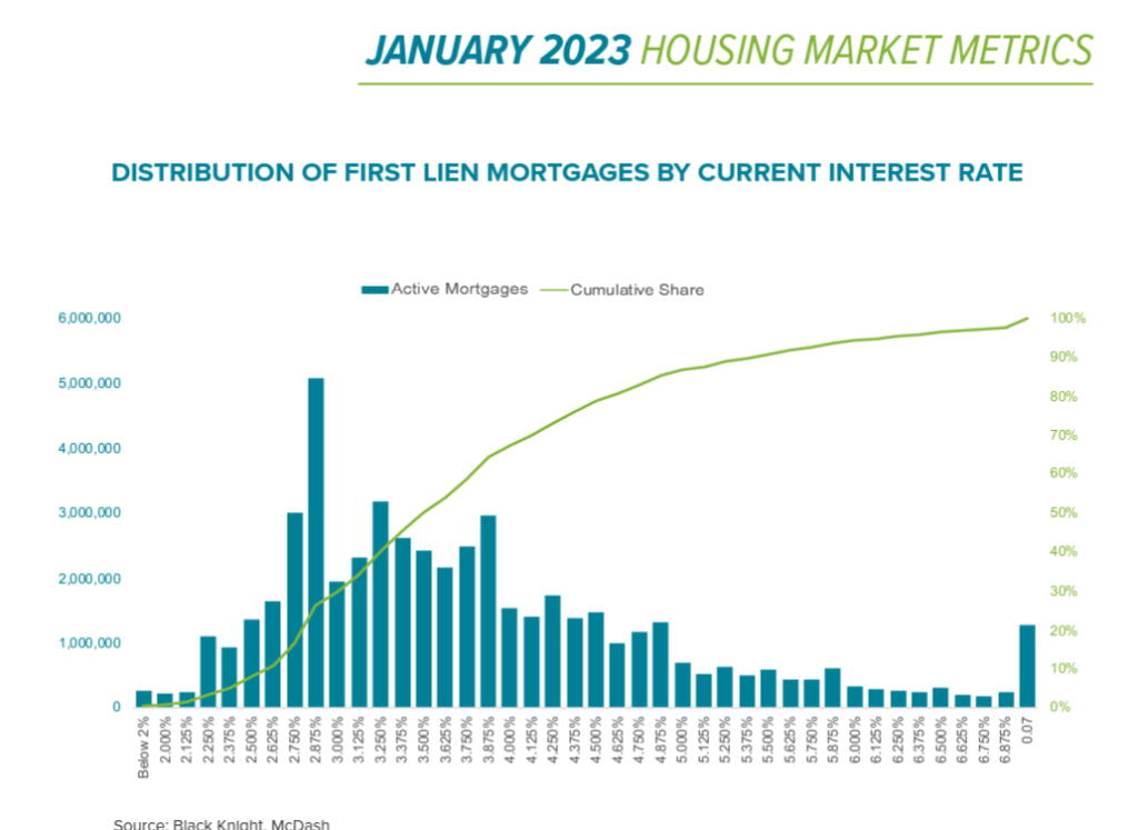
Source: Black Knight, McDash.
Inflation Is Everywhere
Economist Milton Friedman famously said: “Inflation is always and everywhere a monetary phenomenon, in the sense that it is and can be produced only by a more rapid increase in the quantity of money than in output.”
In the U.S., the money supply increased about 30% over two years as policymakers responded to the COVID-19 pandemic.
Output and productivity failed to keep pace with the expansion of the money supply, and the result was inflation.
But the U.S. dollar is not alone.
In the eurozone, the central bank increased the money supply by more than 25%. The result is shown in the table from The New York Times below.
Only China constrained inflation, but the quality of data from China is always questionable.
Now that Friedman has been proven right, we need to consider how to reign inflation in again. That takes time since the economy’s ability to increase output is limited.
Bottom line: The Federal Reserve warned us that the battle against inflation will be painful. It will also be a global battle and our partners may not have the Fed’s same zeal which will only make the battle longer.
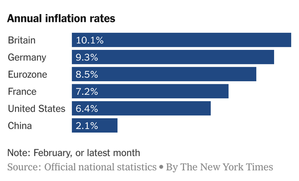
Source: The New York Times.
If You Were Born Before 1970, You Need to See This Chart
The unemployment rate will be released on Friday. It’s likely to be low by historic standards.
One reason unemployment is low is because many people aren’t in the workforce:
- Hundreds of thousands of older workers decided not to return to their jobs after the pandemic.
- Women of all ages are finding child care to be unaffordable and are being forced out of the workforce.
These are just two examples.
But missing from the discussion is the fact that young people aren’t getting jobs like they did 40 years ago.
Just 56.5% of people between the ages of 15 and 24 are in the workforce.
Many are in school, but 40 years ago, it was common to work while also pursuing higher education.
Throughout most of the 1980s, at least 68% of individuals in this age group worked. You can see that peak in the chart below.
Attending college doesn’t cover the whole spectrum of this phenomenon. Young people just aren’t getting jobs.
Bottom line: This needs to change, for their sake and the good of the country, because jobs early in life build habits that lead to success later in life.
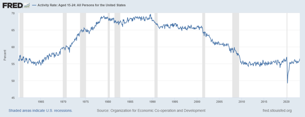
Source: The Federal Reserve.
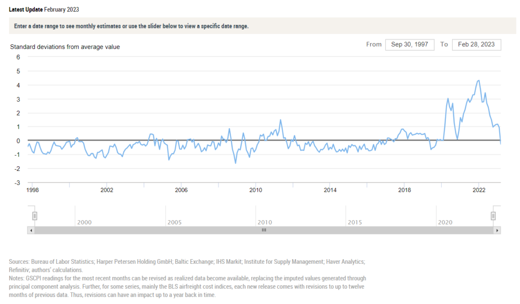
This Chart Says We’re Finally Back to Normal
As consumers, we got used to hearing “supply chain” as an excuse for everything.
Empty store shelves? Supply chain.
Late delivery? Supply chain.
Higher prices? Supply chain.
It sounded like an excuse, but it was a problem.
Federal Reserve economists created the Global Supply Chain Pressure Index to track the problem.
At its worst, the supply chain index was four standard deviations from its average. You can see that in the right-hand portion of the chart below.
That meant conditions like this should be expected once every 10,000 years.
Supply chain pressures have been easing. And in February this index fell enough to cross below its average level.
Bottom line: This is an indicator that the economy is finally back to normal after the pandemic.
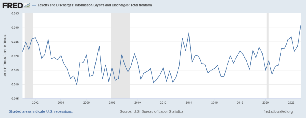
Tech Layoffs Signal Nothing About the Broader Stock Market
Tech layoffs are soaring, especially when compared to layoffs at nontech companies.
The chart below shows layoffs at tech companies as a percentage of all layoffs.
The recent spike is similar to what occurred at the end of 2013.
The stock market was soaring back then, but tech was a laggard. In 2014, the S&P 500 Index rose more than 20%.
The Nasdaq 100 came close to that, but many stocks within the tech sector suffered steep losses.
We aren’t likely to see 20% gains in major indexes over the next 12 months.
But we are likely to see many tech stocks struggle.
Bottom line: Layoff announcements shouldn’t be treated as buying opportunities. Instead, investors need to be selective in this volatile sector.
Source: The Federal Reserve.
Michael Carr, CMT, CFTe is the editor of two investment trading services — One Trade and Precision Profits — and a contributing editor to The Banyan Edge. He teaches Technical Analysis and Quantitative Technical Analysis at the New York Institute of Finance. Follow him on Twitter @MichaelCarrGuru.