The market has rallied to begin 2019, but even a fourth-quarter meltdown to end 2018 wasn’t enough to put a dent in the severe overvaluation of equities.
That’s disappointing news for bulls who were hoping 2018’s decline would at least eliminate stocks that were more overvalued than during any other bull market in U.S. history.
Stocks at the bottom of the correction (or bear market?) were less overvalued than they were at the market’s all-time high that happened last September. But it’s a measure of stocks’ previous overvaluation that the market can dip 15 to 20 percent and still be so overvalued.
Per MarketWatch:
This is the unavoidable conclusion I reached when focusing on six widely used valuation indicators. As you can see from the accompanying chart, the message of those indicators is that the U.S. market in January 2019 is more overvalued than it was at between 67% and 95% of the three-dozen market tops that appear on a bull market calendar maintained by Ned Davis Research.
Here’s a summary of these six measures featured in this chart:
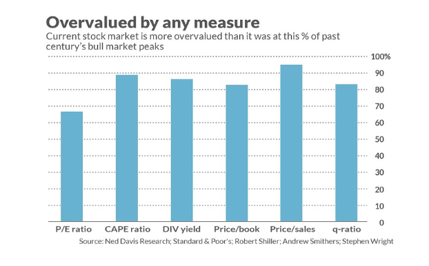
- The price/book ratio, which stands at 3.0 to 1. This ratio is lower than that at 22 of the 29 major market tops since 1929.
- The price/sales ratio, which stands at an estimated 1.9 to 1. At 18 of the 19 market tops since the mid-1950s, the price/sales ratio was lower.
- The dividend yield, which currently is 2.3% for the S&P 500. At 31 of the 36 bull-market peaks since 1900, the dividend yield was higher.
- The cyclically adjusted price/earnings ratio, which currently stands at 29.0. This is the ratio championed by Yale University’s Robert Shiller. It was lower than where it is today at 32 of the 36 bull-market highs since 1900.
- The so-called “Q” ratio, which is calculated by dividing market value by the replacement cost of assets. According Stephen Wright, an economics professor at the University of London, and Andrew Smithers, founder of the U.K.-based economics-consulting firm Smithers & Co., the Q-ratio currently is higher than it was at 30 of the 36 bull-market tops since 1900.
- P/E ratio. This is the valuation indicator that is currently painting the least-bearish (most bullish) picture. Perhaps not coincidentally, it is the indicator that is most often quoted in the financial press. Nevertheless, according to data on as-reported earnings compiled by Yale’s Shiller, and based on S&P estimates for the fourth quarter, this ratio currently stands at 18.4 to 1. That’s still higher than 67% of past bull-market peaks.
How do the bulls respond to the dismal picture these valuation indicators paint? Perhaps the most common of their comebacks is that we should be focusing only on recent stock market history. For example, according to Standard and Poor’s, the P/E ratio is now more than 10% below its average level of the last 30 years.
Note carefully, however, that to focus only on the last 30 years implicitly assumes that the future will more closely correspond to the last three decades than to the century before — when valuations generally were much lower, on average. Do you have good, objective reasons for focusing only on the last 30 years, or are you focusing only on them because they will support your bullish predisposition?
Asking this question brings to mind a column I penned last April, when I quoted Ritholtz Wealth Management’s Ben Carlson saying “You can win any arguments in the markets by simply changing your start and end dates.” And even without taking a position on which particular historical period is most relevant to the stock market’s future, I think we can all agree that consistency is a virtue: We shouldn’t change the periods on which we focus depending on the conclusion we wish to draw.
Which means that if you were concerned last fall about stock market overvaluation, you should be almost as concerned now.