


Editor’s Note: Have you missed any of Mike Carr’s charts in Money & Markets Daily? We’ve got you covered. Monday to Friday, Mike highlights a chart that catches his eye — and what it could mean for markets or the economy going forward. Check out his analysis from the last week below.
Unemployment Claims Point to a Rate Cut
Initial filings for unemployment benefits hit their highest level since late August 2023. Jobless claims totaled 231,000 for the week ending May 4. That’s up 22,000 from the previous period and higher than the Dow Jones estimate of 214,000.
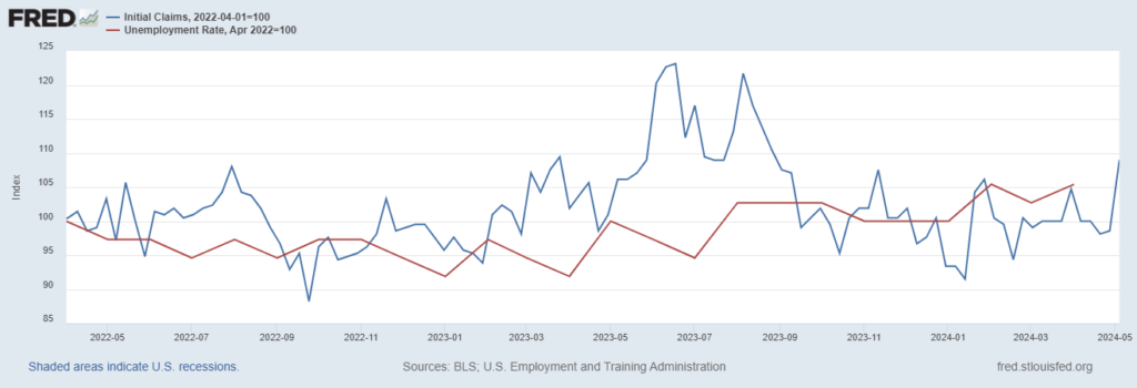
Previous spikes in new claims marked lows in the unemployment rate. The Federal Reserve’s chart, shown below, tracks initial claims (the blue line) and the unemployment rate (the red line). This chart had set both to equal 100 in April 2022 to allow for a direction comparison.
A higher unemployment rate followed spikes in new claims for March and June 2023. The latest reading is likely to be followed by an even higher unemployment rate. That’s bad news for hundreds of thousands who will likely lose their jobs in the coming months. It’s also likely to force the Fed to cut interest rates this summer.
Jobless Claims vs. Unemployment Rate
A Crack in Consumer Spending
Since the pandemic, consumer spending growth has outpaced income increases. Increased debt has made that possible for the past few years. Now, there are signs consumers are having trouble keeping up with debt.
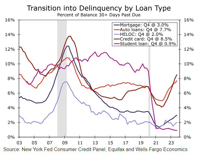
The Wells Fargo chart below shows that credit card and auto loan delinquency are reaching crisis levels. Banks will reduce credit limits for delinquent accounts. Lack of access to credit cards will make it difficult for many consumers to keep spending.
That’s one reason spending is likely to contract. Another is the loss of a car to repossession. If families lose their cars after going delinquent on a loan, they could also lose their jobs. This chart is another ominous turn in the economic data.
President Biden Should Be Watching This Chart
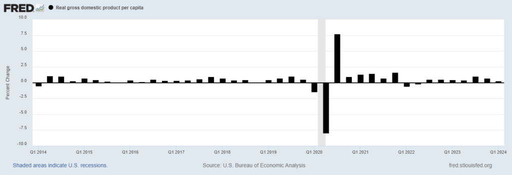
Despite protests from the White House, many voters believe the economy isn’t doing well. And that’s probably because it isn’t. The chart below shows inflation-adjusted GDP per capita. Over time, GDP should rise as the population grows.
This chart adjusts for that factor along with inflation. It shows growth of 0.3% in the first quarter of 2024. Over the long run, real GDP per capita growth averaged 0.49%.
In election years — when growth was below average in the second quarter — the White House changed parties every time since 1948 with just two exceptions. Both Eisenhower and Obama were reelected despite slow growth. However, inflation was less than 2% in 1956 and 2012.
Biden doesn’t have low inflation, so he needs strong growth this quarter. Otherwise, he might get to spend even more at his Delaware mansion.
Real GDP Per Capita
Consumers Have Never Believed the Fed
Gallup recently found that just 34% of U.S. adults have a “great deal” or “fair amount” of confidence in Federal Reserve Chair Jerome Powell. His 36% rating is the lowest Gallup has measured for any Fed chair since its polling began in 2001. Only one chair, Alan Greenspan, has polled above 50%.
This data demonstrates that consumers don’t believe the Fed.
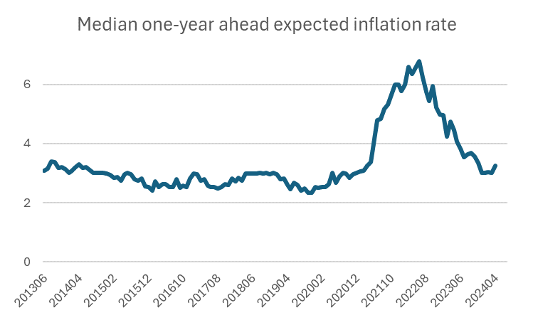
The Federal Reserve Bank of New York’s chart below comes from its Survey of Consumer Expectations. It shows year-ahead inflation expectations. Since the survey began in 2013, consumers have never expected the Fed to reach its target of 2% inflation.
Economist Milton Friedman argued that expectations are a primary driver of inflation. With such low expectations for the performance of the Fed, a robust economic recovery seems unlikely.
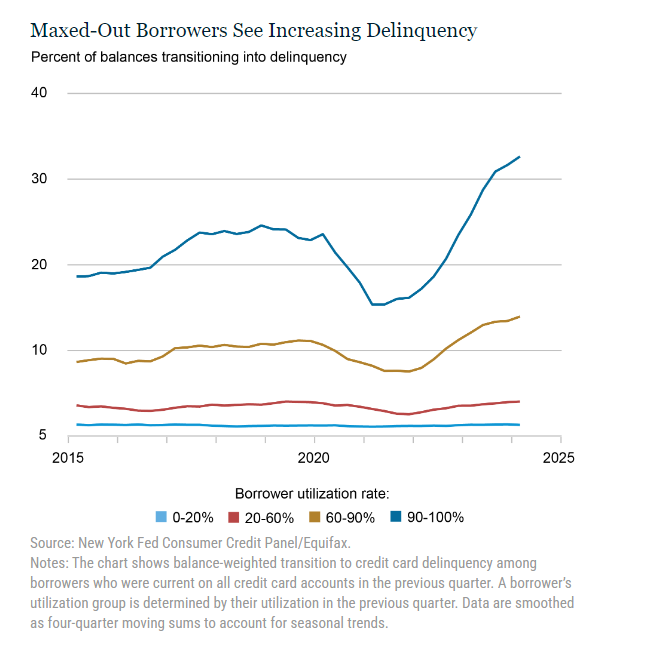
Credit Card Delinquencies Are Rising
Almost 7% of credit card balances became delinquent in the first quarter. That’s a 50% increase from a year ago. Certain characteristics of late payers show where financial stress is developing.
The chart below shows that most delinquent accounts are maxed out. This makes sense since rising balances could be associated with deterioration in family finances. Maxed-out borrowers tend to be in the lowest income quintile and younger. Among Gen Z, 15.3% of borrowers are maxed out. That number is 12.1% for millennials.
High-income, older consumers account for most of consumer spending, so this metric doesn’t tell us much about the economy. But it does tell us that banks face significant problems this year.
That’s it for this week’s edition of Chart of the Day.
Until next time,

Mike Carr
Chief Market Technician