


Editor’s Note: Have you missed any of Mike Carr’s charts in Money & Markets Daily? We’ve got you covered. Monday to Friday, Mike highlights a chart that catches his eye — and what it could mean for markets or the economy going forward. Check out his analysis from the last week below.
Consumers Are Out of Cash
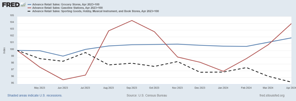
Consumers have limited resources. They can’t spend more than they make for an extended period. Forced to live within their means, they must make choices. In general, consumers have to pay for food and gas — expenses that can’t be eliminated. They can cut spending at sporting goods, hobby, musical instrument and book stores.
The Federal Reserve’s chart below — based on the latest retail sales data — shows that consumers are cutting back on discretionary spending to fund necessities.
Spending at gas stations (the red line) has increased 4% in the past year, driven by higher prices at the pump. Grocery store spending (the blue line) increased 1.9%, less than inflation, indicating consumers are cutting back where they can.
Spending at sporting goods, hobby, musical instrument and book stores (the dashed black line) is down 5%. This confirms that discretionary spending is dropping. Inflation may be falling, but it’s still hurting families.
Consumers Cut Back on Discretionary Spending
1 Government Trick Might Not Work This Year
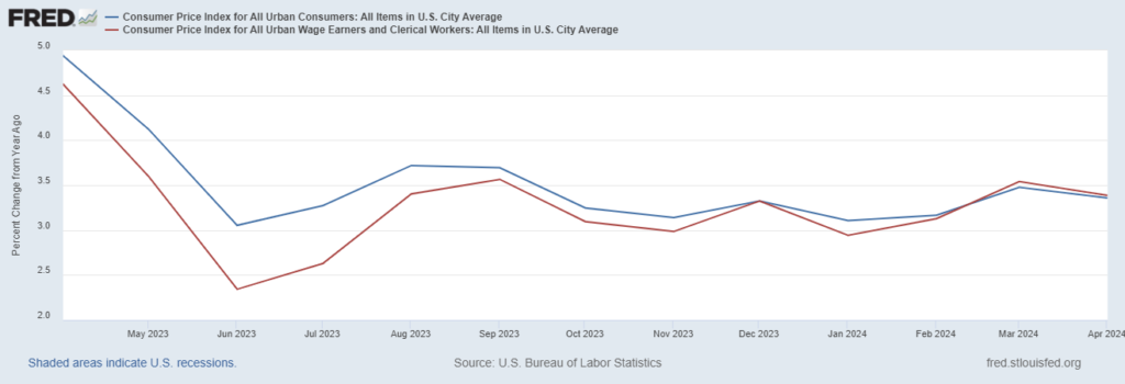
Social Security recipients look forward to their cost-of-living adjustment (COLA) every year. The Social Security Administration (SSA) calculates the COLA for benefits based on the Consumer Price Index for All Urban Wage Earners and Clerical Workers (CPI-W) for the previous year’s third quarter.
Now, you might have noticed something different in that last sentence. The SSA uses CPI-W instead of the more widely followed Consumer Price Index for All Urban Consumers (CPI-U). It’s probably an innocent mistake by someone drafting the law establishing COLA — but it’s been a costly error.
CPI-W is usually lower than CPI-U. This means annual COLAs are lower than they would be if the SSA used the more common definition of inflation. However, this year might be different.
In the Federal Reserve’s chart below, CPI-W (the red line) is slightly higher than CPI-U (the blue line) for the past two months. If this trend continues through September, seniors might get a break and see a higher COLA in 2025.
CPI-W Is Slightly Higher Than CPI-U
The Reason We Think Inflation Is So Bad
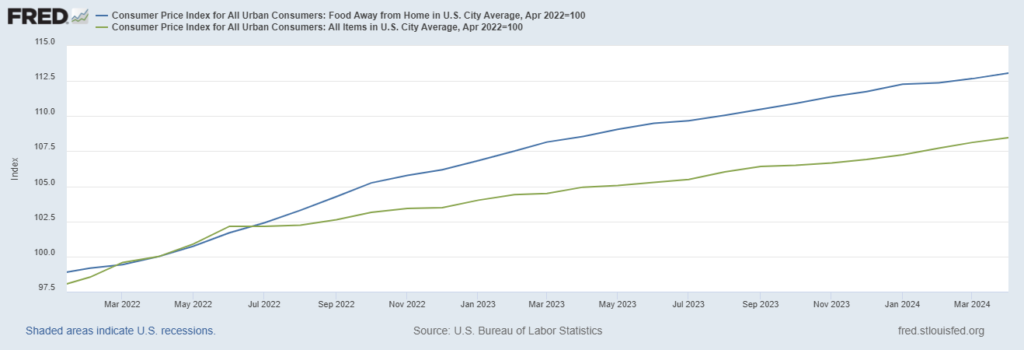
A big story lately is that inflation is lower, and consumers should feel better about the economy. Politicians and economists are telling us we are in good shape. There are a lot of problems with that narrative, and the Federal Reserve’s chart below shows one reason consumers remain focused on inflation.
The blue line is the cost of eating out, technically the Consumer Price Index for food away from home. The green line is the Consumer Price Index, a measure of overall inflation. The difference between the two is how much more we pay to celebrate graduations and other special occasions. The rapid increase in the cost of celebrations explains why consumers feel like the economy is worse than officials tell us.
CPI for Food Away from Home Vs. Overall Inflation
Supply Chain Pressure Adds to Fed’s Worries
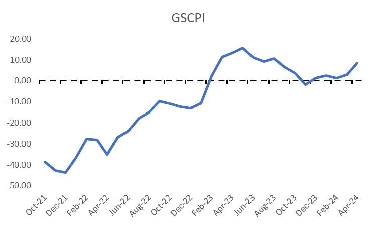
Evidence continues to mount that the Federal Reserve will struggle to cut interest rates later this year. Post-pandemic inflation has several causes, but one that gets cited often is the unprecedented supply chain disruption.
In the auto industry, for example, manufacturers canceled orders as sales dipped during lockdowns. Stimulus checks quickly boosted demand, but manufacturers faced months of delays because of impulsive decisions.
As inflation soared, the Fed developed the Global Supply Chain Index (GSCPI) to monitor this trend. Positive values in the index, shown as the blue line in the chart below, indicate potential problems in the supply chain.
With manufacturers facing potential bottlenecks, the fight against inflation may be stalling, and a rate cut may have to wait until 2025.
Potential Good News for the Fed
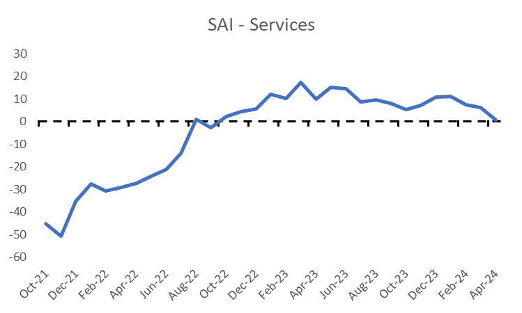
Yesterday, we looked at inflationary concerns affecting manufacturers. Today, we’ll look at services.
In October 2021, Federal Reserve economists began asking businesses if supply availability had improved, remained unchanged, or worsened compared to the prior month. This allowed them to create indexes of supply availability for both service firms and manufacturers.
The Supply Availability Index (SAI) for services is the blue line in the chart below. Positive values of the SAI suggest that supply availability improved. The index remains positive but will be closely watched in the coming months.
Services account for about one-third of the Consumer Price Index (CPI). If SAI-Services can remain positive, the Fed might be able to continue easing its policy — potentially reducing the pace of quantitative tightening further rather than offering consumers a much-needed interest rate cut.
That’s it for this week’s edition of Chart of the Day.
Until next time,
Mike Carr
Chief Market Technician