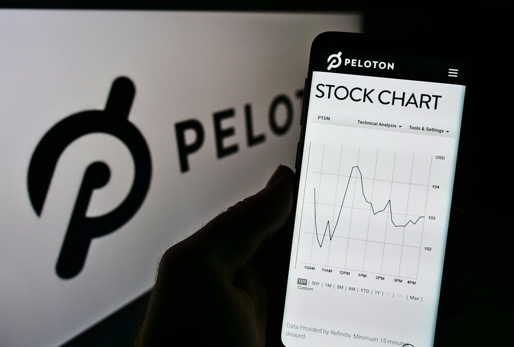
As the pandemic raged, health clubs closed, and Peloton showed us the future of fitness. Millions ordered the pricey bicycles and subscription packages.
Of course, those who don’t remember history are doomed to repeat it. Looking back, it was easy to see where Peloton bikes were headed. They would join Nordic Tracks and generic exercise equipment in holding laundry in millions of bedrooms around the country.
But it was the pandemic. Peloton had a new technology. Customers and investors argued that this time was different. We know that’s not true. This time was exactly the same.
The chart below is of Peloton Interactive Inc. (Nasdaq: PTON), but it could be of any bubble. As we enter a potential bear market, it provides an opportunity to review how bubbles end.
PTON: A Bubble Visualized
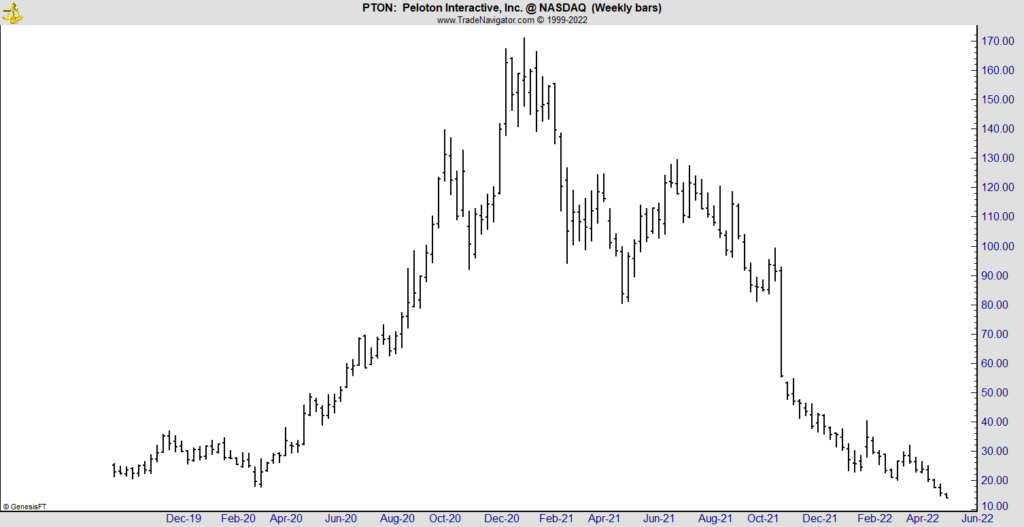
What PTON Says About Market Bubbles
PTON began trading in October 2019. Investors seemed unimpressed with the stock as it moved up slightly and then fell back to the level it started trading at. Analysts questioned how big the market for pricey exercise equipment was and whether consumers would maintain subscriptions after they paid off the bike.
When the pandemic hit, PTON became one of the hottest stocks. The company was positioned to benefit from the stay-at-home trend. The stock soared, rallying 860% in less than a year.
As the decline started, bulls bought the dip. They argued that the stock was worth $170 a few weeks ago, so it must be a bargain at $100. They also argued the company had a great product and would deliver profits.
I’ll ignore Peloton’s financial woes except to note that the new CEO said he is surprised to discover how bad things really are.
Bottom line: The chart above illustrates that bubbles are always a round trip. Prices always fall to where the bubble began, or lower.
With hundreds of stocks experiencing bubbles in the past two years, this is an important lesson to remember.
Click here to join True Options Masters.