
Do you have whiplash yet?
After a brutal start to the week, stocks rallied hard on Wednesday and Thursday, clawing their way back to breakeven on the week.
Yesterday, I commented that September is often a rocky month in the market. It’s one of the few months that is negative on average, and volatility tends to pick up this time of year.
Now we’ll dig a little deeper.
We already looked at the Dow’s average monthly returns over the past 50 years. Today, let’s look at the broader S&P 500 and take the data all the way back to 1928.
The precise numbers are a little different, but the pattern holds up well.
The pre-Depression economy of 1928 was vastly different than the post-WWII economy of 50 years ago or our digital economy of today.
Over that period, we’ve seen Americans migrate from the countryside to the cities and then from the cities to suburbs. We’ve seen the mass electrification of the economy and then the introduction of mass communications via the phone and later the internet. We even added two states to the Union.
Yet seasonal patterns have persisted through it all.
Stock returns in the months of May through October tend to be lower than the November through April period. And after a strong start in January, there is often an early-year pause in February.
Averages are exactly that: averages. Every year is different. But it’s foolish to ignore seasonality. It’s a tool that can turn an average strategy into a great one.
Let’s drill down deeper into the numbers.
This Isn’t a Surprising September
September has the lowest average return of all 12 months. And it’s the only month that had more monthly losses than gains over the past 92 years. Here’s a comparison since 1928:
- September: 50 losing months vs. 42 profitable months.
- November: 36 losing vs. 57 profitable months.
- December: 25 losing vs. 68 profitable!
You’ve probably heard the old maxim that the stock market takes the stairs up and the elevator down. In other words, advances tend to be slow and steady whereas declines are quick. And if you look at September alone, that saying holds some truth. The average loss in September is -4.6%, and the average gain is 3.2%.
But we're nowhere near the worst September ever. Over the last 40 years, the average “worst annual drawdown” was 14.3%. We aren’t even a third of the way there in 2021.
A More Profitable Pattern
Calendar patterns go far beyond monthly returns.
There are regular, repeating patterns even within the week, and I’ve found the perfect way to profit from these patterns.
Need proof? Check out this chart:
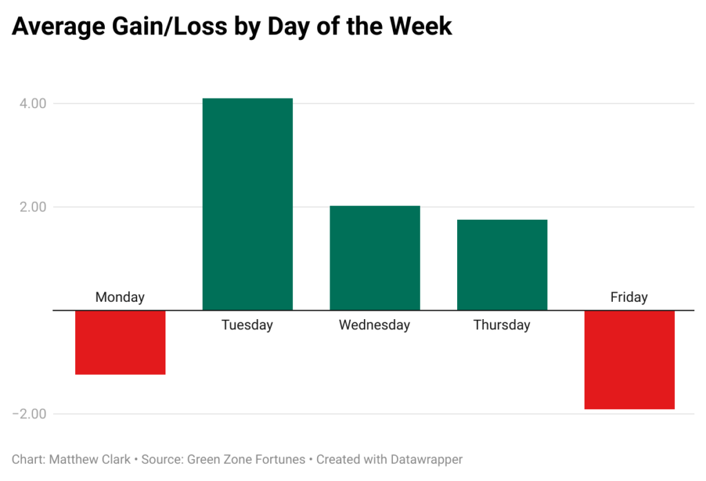
This chart looks a lot like what we experienced earlier this week. Major indexes were hit with a major sell-off Monday. We didn’t see a huge pop on Tuesday, but investors were back into buy mode on Wednesday and Thursday.
When I saw this chart a while ago, a lightbulb went off in my head. The market is showing us a “sweet spot” that we can trade each and every week.
So I got to work.
Over the last six months, my team and I have been beta testing a simple two-day trading strategy.
In our six-month time frame, this strategy beat the market by 51 times.
It’s so simple. We're in on Monday afternoon, when stocks are historically lower, and we’re out again 48 hours later.
This approach to the market led us to 15 triple-digit wins in only six months, and we aren’t done.
I’m ready to lead you to your own Wednesday Windfalls with your first trade this coming Monday. Click here to watch my presentation, and get the details on how to join now.
See you Monday!
To good profits,

Adam O’Dell
Chief Investment Strategist, Money & Markets