
There’s a funny thing about the prices of goods and services.
Prices are seemingly always going up.
For the most part, it’s true.
Two occasions when prices actually fell were:
- 1929-1933 — During the Great Depression, prices actually fell around 27% as the unemployment rate reached as high as 25%.
- 2009 — At the height of the Great Recession, consumer prices fell just over 2% as unemployment reached 9.5%.
The reason the price of goods and services fell during those two occasions was tied directly to unemployment.
Under the rule of supply and demand, when demand is up, supply is down, and prices increase. In the reversal, when demand is down, supply is up, and prices fall.
During eras of high unemployment, people are buying less and spending less; therefore, supply goes up… prices fall.
However, instances of higher-than-usual unemployment are rare; thus, demand for goods and services remains high… as prices.
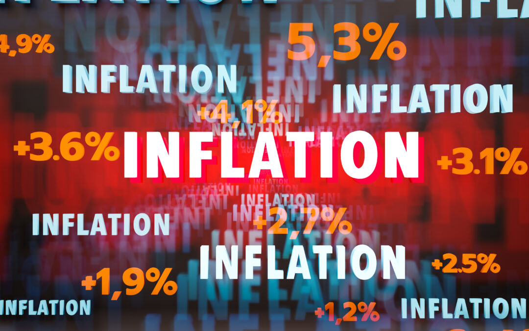
I mention all of this because the June Consumer Price Index (CPI) was released on Tuesday, and financial news headlines were all over the place:
Inflation Picks Up Again in June, Rising At 2.7% Annual Rate (CNBC).
U.S. Core Consumer Prices Rise Less Than Expected Again (Bloomberg).
Inflation Picks Up to 2.7% As Tariffs Seep Into Prices (Wall Street Journal).
To the average consumer, it’s hard to tell if June’s CPI figure was good news or bad.
Let’s try to break it down…
Data Can Be In the Eye Of the Beholder
When analyzing data, outcomes can be based on how you interpret the data.
Let me show you…
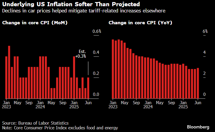
The left chart shows the change in CPI month over month, while the right chart shows the index’s year-over-year movement.
If you only look at the chart on the left, you might conclude that inflation is ticking up, which could be problematic.
However, analyzing just the chart on the right could lead you to believe that inflation is coming down.
Both charts are correct, but only analyzing one or the other can leave you drawing different conclusions about the state of inflation.
This is what I would consider “surface data.” It’s just the raw numbers.
My question is always… what’s the real story?
For that, we have to dive even deeper into these CPI figures.
We know that CPI, excluding volatile food and energy, went up 0.2% month over month. What you don’t see is why the increase was nominal.
Vehicle Prices Help Drive CPI
This chart shows the percentage change for all items (red line) and new vehicles (yellow line).
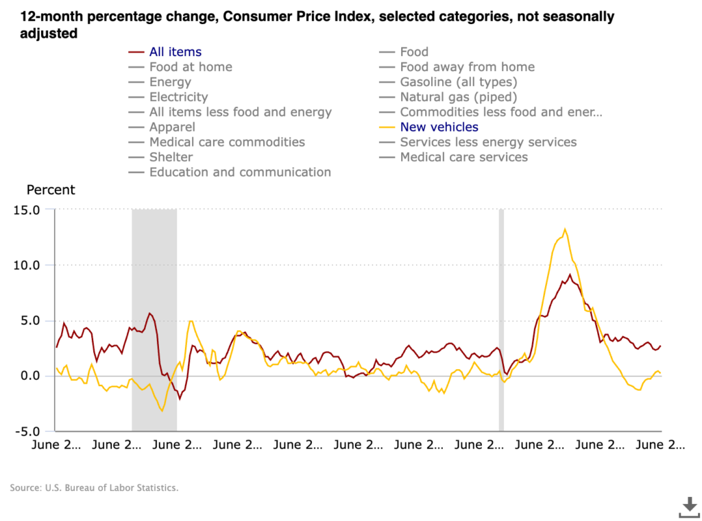
The dramatic drop in vehicle prices is one of the leading factors in why the year-over-year CPI has changed little.
However, if you take out the change in vehicle prices, core goods prices actually went up 0.55% in June — the most significant monthly jump since November 2021.
One big thing to keep in mind here is that these drops do not indicate that prices are coming down… they mean they are still going up, but at a slower pace. CPI is a rate of change.
Look back at the chart above…
The red line (all items) only briefly fell below 0.0% in 2009, during the Great Recession, and again in 2020 during the COVID-19 pandemic. Otherwise, it stays above 0.0%, meaning the price of all goods and services has continued to increase over time.
Want further proof?
CPI Rarely Retreats… Always Advances
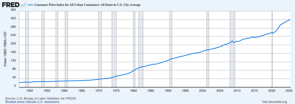
Here is the CPI charted all the way back to 1947.
It only shows very brief instances when prices actually went down. Otherwise, the rate of price changes for goods and services has remained in a constant uptrend.
The point here is like I tell my wife and kids… There are three sides to every story. Yours, mine and the truth.
It is essential to look beyond “surface data” and find the real story… especially when it comes to something as critical as what we pay for goods and services.
That’s all from me today.
Until next time…
Safe trading,

Matt Clark, CMSA®
Chief Research Analyst, Money & Markets